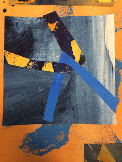
I Spent a long time trying to figure this chapter out. Hopefully I have took the correct path for the following samples.
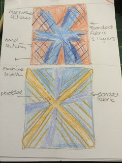
I found it easier to design the samples on paper first and picking techniques to use. I have photo evidence of my scribbles.
This helped me tremendously by keeping me focused. I did change a few samples as I went along and when idea's popped into my head.
 |
8.1
|
I'm pleased how both the these samples turned out. However I must say the bright orange looks red on this scan but I assure you its orange. I love the shapes and the complexity.
 |
8.2
|
These are my favourite samples out of the six. The top sample is by far the most eye catching (but that is just my opinion). The second sample was not on my original list of designs. I used the negative shape form the previous sample page to create this sample, and I'm glad I did. This is my most interesting sample (in my opinion).
 |
| 8.3 |
My final sample page. This is blurred which I assume because of the padding. The top sample I'm not sure about. I don't know why, maybe its the design shapes. The bottom sample works better, looks full of texture. Because the page is blurred I've taken photos to show the areas of padding.
This chapter has been very enjoyable and interesting. I'm amazed how one set of shapes can produce so many different looks and even in the same colour combination.
I have probably taken longer than needed for this chapter however planning and sketching idea's really helped.
Time taken - 25 hours.


